Why Modern Businesses Can't Scale Without Dashboards
In small businesses, decisions can often rely on intuition. At a $1M revenue level, you can "wing it" because the stakes are relatively low. But once a company reaches $10M or more, guessing no longer works. Mistakes scale too quickly, and the cost of missed opportunities grows fast.
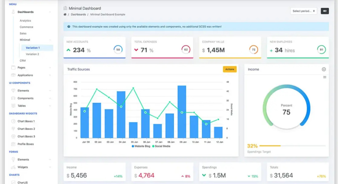
Dashboards shift your company from "I think" to "I know." Data-driven organizations consistently outperform their peers—research shows they are 5–6% more profitable on average. They spot problems in real time rather than discovering them months later, after they've already cost tens of thousands of dollars.
The ROI is tangible. By centralizing and automating reporting, dashboards can cut reporting time by up to 80%. A $30K–$100K investment in business dashboard development often pays for itself within 6–12 months through efficiency gains and cost avoidance. Beyond money, dashboards give speed: faster decisions, earlier interventions, and clearer visibility into the health of your business.
Dashboard as a Management Tool: What Problems It Solves
A well-built dashboard does more than display numbers—it impacts how your company sees and acts on information.
Eliminating information silos across departments
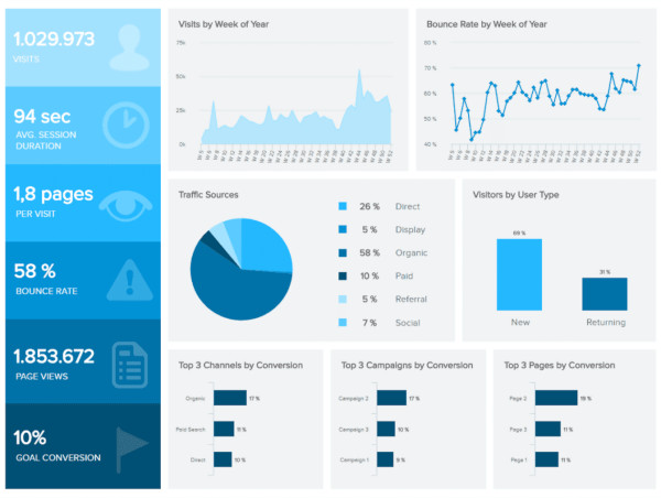
Departments often operate in isolation. Sales relies on their CRM, Marketing tracks Google Analytics, Finance manages spreadsheets, and Operations uses separate tools. Without a unified view, everyone sees only part of the story.
Marketing may celebrate 1,000 new leads, but Sales knows only 50 are qualified, and Finance notices CAC is too high. Building dashboards unifies data from all tracking tools, creating a single source of truth. So it basically ensures everyone in your company works with the same information.
Reducing decision-making time from days to minutes
Before dashboards, executives face slow, manual reporting. Ask "How's our performance this quarter?" and an analyst spends 2–3 days pulling data from five systems, building an Excel report, and validating numbers. Valuable time is lost—time that executives often bill at $500+/hour. But: open your dashboard, and you get the answer in 30 seconds. Immediate decisions and faster action are guaranteed.
Identifying trends before competitors
Dashboards act as early warning systems. They can reveal that a new competitor is gaining market share months before quarterly reports reflect it, highlight slowing adoption of a product feature before retention becomes a problem, or spot emerging seasonal patterns to optimize inventory. In other words, companies with dashboards act proactively while others react too late. This first-mover advantage often translates directly into profitability.
Measuring what matters: KPIs that drive growth
Not all metrics are equally valuable: many businesses track vanity numbers like total users while ignoring actionable KPIs such as active users or revenue per user. Dashboard design forces clarity: only 7–10 key metrics fit on a main screen, so you can focus better.
For example, a startup tracking 30 metrics rebuilt its dashboard around five core KPIs—MRR, churn, CAC, LTV, and burn rate—and saw focus and growth improve immediately. As the saying goes: "What gets measured gets managed"—but only if you measure the right things.
Types of Business Dashboards: Which One Your Business Needs
Not all dashboards serve the same purpose—for example, when building data dashboards, it's important to match the design to the type of decisions you need to make. Each dashboard focuses on a different level of detail, from company-wide strategy to day-to-day operations.
Executive Dashboard
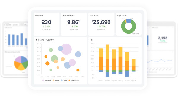
Executives don't need more data—they need clarity. An executive dashboard gives a snapshot of company health and progress toward key goals, without the noise. It highlights only the key performance indicators that truly drive direction and performance. In board meetings or investor calls, it replaces ten reports with one screen that shows what's working, what's not, and where to focus next.
Operational Dashboard
This one keeps the business running day to day. It tracks real-time data from across departments so managers can see performance issues the moment they appear. When operations, support, or logistics slow down, it's visible instantly—no waiting for the end-of-month report. These dashboards turn reaction into prevention.
Financial Dashboard
Cash flow, profit margins, budgets—all business analytics in one place. A financial dashboard makes numbers visible in context, not buried in spreadsheets. It helps leaders and investors see how money moves through the business, whether targets are on track, and where the financial risks or opportunities lie.
Marketing & Sales Dashboard
This dashboard connects effort to impact. It pulls data from CRM, ads, and analytics to show how leads turn into revenue. Instead of guessing what's working, teams can see acquisition costs, funnel drop-offs, and ROI on campaigns, and adjust in real time.
Product Analytics Dashboard
Product teams use this one to understand how people actually use the product. It shows which features are best accepted, where users drop off, and what predicts churn. The goal isn't just to collect your data, but to learn from it. You see patterns early and ship smarter updates.
What You Need to Build a Dashboard: Prerequisites
Before you start building dashboards, make sure the basics are in place. A dashboard is only as good as the data, clarity, and commitment behind it.
Data Infrastructure
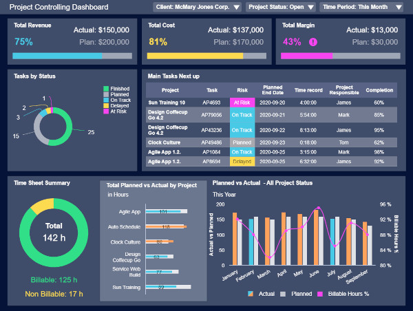
You can't build a dashboard without a solid data foundation. Your business needs systems already collecting data from reliable sources like CRM, analytics, transactions, digital marketing platforms, and so on. You also need a way to access that data and confirm it's clean enough to trust. Developing an ERP system can assist in filtering and prioritizing information, making dashboards even more effective for decision-making.
If the information lives in random Excel files scattered across departments, it's too early. A data warehouse is ideal but not essential for simpler dashboards; what matters most is data reliability and accessibility.
Business Clarity
You can't build something useful if you can't answer, "What problem are we solving?" Clear purpose first, design second. And this is where most projects fail. Companies want dashboards but can't clearly say what they're trying to measure. Before asking how to create a data dashboard, get alignment on:
- your goals,
- the KPIs that matter, and
- the decisions the dashboard will support.
Stakeholder Buy-in
Even the best dashboard dies without ownership. You need executive sponsorship, budget approval, and cooperation from teams to share data sources. Someone at the top must champion the project, and people must actually use the tool. A $50K dashboard that the CEO never opens is just a screensaver.
Business Requirements: Questions to Answer Before Developing Dashboards
Jumping straight into design is a mistake. Before you start developing dashboards, you need clarity on what the tool is meant to achieve, who it's for, and what data it depends on. A few hours spent defining these requirements saves weeks of rework later.
Strategic Questions
These set the direction for your business. They define the why behind the dashboard and align it with your broader goals:
- What business decisions will this dashboard inform?
- Who needs access—and how often?
- What's the cost of not having this information now?
- Which key metrics directly impact revenue or performance?
Clear answers here help ensure your dashboard supports informed decisions, not just data display.
User Definition
Different users need different levels of detail. Defining your audience shapes everything—from layout to data visualization choices:
| User Type | Typical Needs | Example Use Case |
|---|---|---|
| C-level Executives | Snapshot of overall business performance | Company-wide KPIs and growth trends |
| Department Heads | Operational visibility and team results | Daily efficiency, budget tracking |
| Analysts & Operators | Detailed, drill-down data | Identifying causes, running scenarios |
| External Stakeholders | High-level performance and ROI | Investor or board updates |
Data Requirements
You can't visualize what you can't measure. Define:
- Which data sources you'll integrate (CRM, ERP, analytics, etc.)
- How frequently data should update—real time, daily, or weekly
- How much historical data is required for trend analysis
- What benchmarks or targets you'll compare against
Well-defined data inputs turn a dashboard from a "nice to have" into a trustworthy business intelligence tool that supports real decision making.
Dashboard Development: What Happens Behind the Scenes
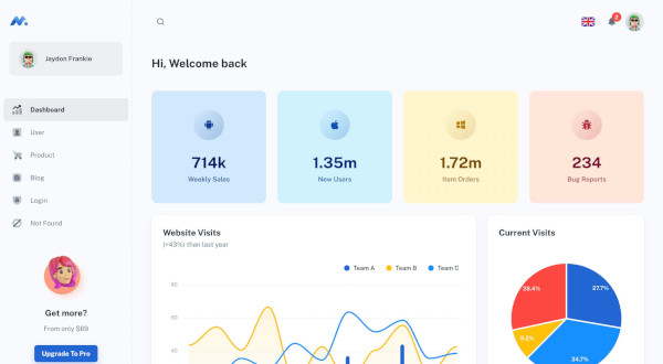
Every strong dashboard follows a structured process, and if you skip steps, it usually means you will start over later. If you've ever wondered how to create a data dashboard that people actually use, here's what happens behind the scenes.
Phase 1: Discovery and Planning
Everything starts with context. Before anyone touches a chart, teams run stakeholder interviews to uncover what decisions the dashboard should support. They analyze current workflows, map where data lives, and hold KPI workshops to align on measurable goals. A short technical assessment confirms what's possible within your systems.
This phase sets direction and prevents the "nice-looking but useless" dashboard problem.
Phase 2: Data Architecture
First, engineers map every data source that will feed the dashboard. They identify where data overlaps, where it's missing, and which systems are the single source of truth. Then comes the design of the storage layer:
- For simple setups, this may be an SQL database or Google BigQuery with scheduled imports.
- For larger ecosystems, a dedicated data warehouse (Snowflake, Redshift, or Azure Synapse) is configured to centralize data and maintain consistency.
Next, the ETL process. Engineers write scripts or use tools like Airflow or Fivetran to automatically pull raw data, clean it, normalize date formats, merge duplicate entries, and align naming conventions.
Data quality checks are automated: missing fields, broken links, and outliers trigger alerts. Performance optimization comes through proper indexing, partitioning, and caching—so dashboards load in seconds even when querying millions of rows.
Finally, scalability planning. Engineers test load behavior and storage growth assumptions to ensure your business won't outgrow the infrastructure in six months. That means modular pipelines, flexible schemas, and enough computing headroom to handle spikes in data volume without rewriting half the system.
If you want a setup that scales smoothly and doesn't collapse under growth, reach out to MaybeWorks—we'll help you build data architecture that's built to last.
Phase 3: Dashboard Design
Information architects map the full experience—what users see first, which KPIs deserve top placement, and how filters, segments, or comparisons help uncover insights. They decide how summary views connect to detailed reports, the flow here shall mirrors how people actually make decisions.
Designers then translate this structure into a clear, intuitive interface for both desktop and mobile. They test contrast, chart readability, and responsiveness across screen sizes. Finally, they validate the entire flow through interactive prototypes. They watch how users navigate, interpret trends, and act on data. This helps catch usability issues before development starts and every change becomes expensive.
Phase 4: Development
Developers connect the dashboard to your company's data sources, build the backend logic, and implement visualizations that reflect your specific KPIs. Security measures—like access controls and permissions—are added to protect sensitive data. Engineers implement role-based access control, so executives, managers, and analysts each see only the information they're meant to.
Sensitive datasets (like financials or HR records) are encrypted both in transit and at rest. Authentication layers—from single sign-on to multi-factor—ensure no one outside your company can slip through. Permissions are also fine-tuned on the visualization level: who can filter, export, or drill down into data.
Phase 5: Testing and Refinement
Dashboards look simple, but real users quickly expose weak spots. Testing involves executives and end users validating whether the dashboard answers their questions without friction.
Performance testing goes beyond checking load times—engineers simulate real usage with full-scale datasets to spot bottlenecks early. They optimize query speed, caching, and API response under heavy load, ensuring dashboards stay responsive even with millions of records. Meanwhile, security audits verify encryption, permissions, and compliance with standards like GDPR or SOC 2 before launch.
Phase 6: Deployment and Training
Rollout happens in controlled stages—often starting with pilot teams to collect feedback before company-wide release. After deployment, training sessions help users interpret KPIs correctly and apply insights to real decisions. Documentation, recorded demos, and support channels make adoption seamless.
Dashboard Design Best Practices for Business Users
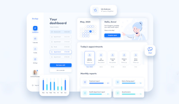
A dashboard's value is its usability. You can have perfect data and KPIs, but if people struggle to read or navigate the interface, they'll go back to Excel. These dashboard development tutorial insights focus on structure, clarity, and real-world use—what actually helps teams understand and act on the information.
Information Hierarchy
Start with clarity, not quantity. Place the most critical metrics above the fold so decision-makers can spot the main data in seconds. Use progressive disclosure—summary first, details later—and drill-down capabilities that let users explore data without losing context.
For example, an executive might see company-wide revenue trends upfront, with a click to view regional or product-level breakdowns.
Visual Design Principles
Good dashboards don't look flashy—they communicate clearly. Keep layouts clean and uncluttered, use consistent color codes to indicate performance, and leave white space to guide attention. Likewise, when you convert Figma to React components, careful attention to design elements like color ensures that the end product is visually intuitive and user-friendly.
A quick glance should tell users what's working and what needs attention. Don't forget mobile optimization: busy executives often check dashboards on phones between meetings.
Usability for Non-Technical Users
A dashboard will succeed only if people actually use it. To ensure this:
- keep navigation intuitive—group insights by workflow, not by data source,
- add contextual tooltips that clarify what each metric means and how it's calculated. This substantially reduces the "what does this number include?" confusion,
- ensure every chart or table can be easily exported for presentations or reports, without the help of IT department,
- finally, personalize views by user role. Finance tracks budgets and margins, marketing monitors campaigns and conversion rates, leadership sees both. This way every team gets what they need.
If you're unsure where to start or want to refine an existing setup, MaybeWorks can guide you through every step—from UX structure to real-world testing—to make your dashboard both powerful and user friendly.
Technology Stack: How Dashboards Are Built
A reliable dashboard rests on the right mix of tools—those that gather, process, and visualize your data efficiently. The tech stack defines how scalable, secure, and future-proof the solution will be.
Visualization Libraries
Libraries like D3.js, Chart.js, and Recharts power interactive visuals. For advanced needs—heatmaps, custom maps, or dynamic drill-downs—teams use Plotly or Highcharts. The aim is clarity: transforming complex data into insights.
Modern Dashboard Platforms
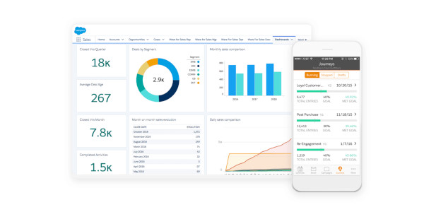
Businesses usually pick between custom builds and BI tools like Power BI, Tableau, or Looker.
- Custom dashboards fit unique workflows and data structures.
- BI tools offer faster setup and built-in integrations.
Whatever the route, ensure it scales with your data warehouse and supports enterprise-level governance.
Infrastructure Considerations
Most companies now choose cloud hosting (AWS, Azure, Google Cloud) for flexibility, though on-premise remains an option for stricter control. Encrypt data, enforce permissions, and verify GDPR/SOC 2 compliance. Reliable setups include disaster recovery and uptime monitoring.
Investment Perspective: Time, Budget, and ROI
Investing in a dashboard isn't just about software—it's about faster decisions and measurable impact.
Budget Breakdown
Simple dashboards with a few KPIs and data sources cost $15K–$30K. Medium solutions with integrations and interactive features run $40K–$80K, while enterprise dashboards with advanced analytics and custom architecture often exceed $100K. Plan for ongoing maintenance at 10–15% annually.
Timeline Expectations
An MVP dashboard can be ready in 4–6 weeks. Full-featured dashboards take 2–3 months, and enterprise rollouts with multiple teams or data warehouses may require 3–6 months, often delivered in phases.
ROI Indicators
Dashboards cut reporting time by up to 80%, speed decision-making, and help detect issues early, saving tens of thousands. They also improve resource allocation, with most companies seeing payback within 6–12 months.
Critical Mistakes That Cost Money
Dashboards can be powerful decision tools. Yet, missteps quickly turn them into expensive, unused systems. Here's where companies most often go wrong and how it impacts your business.
Business Mistakes
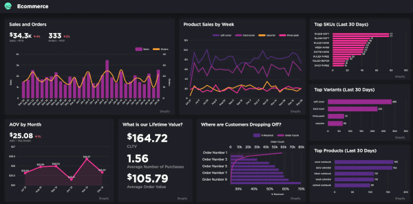
Many dashboards fail because they are built without a clear purpose. Tracking too many vanity metrics, like total users or page views, distracts from actionable KPIs that actually drive revenue. Lack of executive buy-in means the dashboard sits unused, wasting investment. Ignoring data quality—duplicates, missing values, or inconsistent formats—leads to misleading insights and costly mistakes.
Technical Mistakes
A technically weak dashboard frustrates users. Slow performance on large datasets, rigid architecture that can't scale with growing data, and missing mobile access make the tool impractical. Security oversights—unencrypted data or poorly managed permissions—expose sensitive business information and create compliance risks.
Design Mistakes
Even technically sound dashboards fail if the design overwhelms users. Presenting too many metrics at once or showing numbers without context leads to confusion. Static dashboards without interactivity prevent users from drilling into issues. Inconsistent refresh rates make data stale, eroding trust in the system.
When to Build vs. Buy
Deciding whether to build a custom dashboard or use an off-the-shelf solution depends on your business needs, resources, and goals.
Build Custom Dashboard When:
- your business has unique processes,
- requires specific integrations that standard tools don't support,
- you need tailored visualizations, or
- want to track proprietary metrics that give a competitive edge.
Custom solutions offer flexibility and control but require more time, budget, and technical expertise.
Use Off-the-Shelf Solutions When:
- you track standard business metrics,
- you need fast deployment,
- your team has limited technical resources,
- you want to test the dashboard concept before committing to a full custom build.
Off-the-shelf tools provide speed and simplicity, though customization options are more limited.
Why Partner with an Experienced Development Team
If you don't have in-house engineers, the answer is obvious—bring in professionals. But even with your own team, lack of dashboard experience can slow you down. It takes time to learn data modeling, visualization logic, and optimization through trial and error. Partnering with a team that's done it before means faster delivery, fewer mistakes, and a system that works from day one. MaybeWorks can help you get there efficiently.
The MaybeWorks Approach
We design dashboards that actually solve real business problems, not just look nice. Whether you're a startup or an enterprise, we bring hands-on experience across fintech, e-commerce, SaaS, and healthcare, tackling the specific challenges of each industry. We focus on metrics that drive decisions, ensuring executives and teams get actionable insights immediately.
After launch, we don't walk away—we continuously optimize performance, scale pipelines, and adjust dashboards as your business grows, so you always stay ahead of problems instead of reacting to them.
Our Dashboard Expertise
We build executive dashboards that let C-suite leaders see key metrics in seconds, investor dashboards with automated updates to avoid manual reporting, and operational dashboards that highlight bottlenecks before they cost you money. For SaaS platforms, we create multi-tenant dashboards so every client sees their own performance without manual configuration.
Technologies We Master
We work with modern visualization libraries for clarity, real-time processing to catch issues immediately, and enterprise integrations to unify CRM, ERP, marketing, and analytics systems. Cloud infrastructure ensures reliability and compliance, so you get dashboards that are fast, secure, and actionable from day one.
Case Examples
We partnered with a client developing a real-time annotation and screen capture tool for live web pages, PDFs, and other digital assets. Their existing dashboards were functional but lacked efficiency and intuitive features, slowing feedback loops and limiting the ability to analyze results quickly.
Our Full Stack developers worked alongside the client's team, following best practices in making dashboards to enhance functionality and improve usability. Key improvements included:
- Code optimization and refactoring for faster load times and smoother interactions
- Implementation of new web tools to extend dashboard capabilities
- Resize functionality for flexible screen and component adjustments
- Share feature allowing instant collaboration across teams
- UI redesign using React, TypeScript, Firebase, and Recoil for a more intuitive user experience
The outcome: users could provide feedback and annotate assets faster, teams collaborated seamlessly, and the dashboard became a reliable tool. This project demonstrates how dashboard examples can turn complex processes into actionable insights and streamline workflows.
Feel free to contact us today to get your team augmented with MaybeWorks developers.
Next Steps: From Idea to Implementation
Turning a dashboard idea into a working tool takes planning and technical focus. Partnering with MaybeWorks helps you move faster. We evaluate your data readiness, define clear priorities, and guide development so effort goes where it matters most. Here's how the process usually unfolds.
Free Initial Consultation
Book a free technical session with our engineers to see what's possible. During a short discussion, we:
- Clarify goals — what decisions the dashboard should support.
- Review your data sources to see what can be connected or needs cleaning.
- Discuss technical options and the best tools for your setup.
- Outline time and budget estimates so you can plan confidently.
You'll get a clear timeline, cost range, and practical answers to your questions—a grounded view of what building your dashboard really involves.
Start with MVP
Next, we design and build a lean MVP dashboard focused on your most important KPIs. It's a fast, low-risk way to test how data supports daily decisions, gather feedback from real users, and refine the logic before scaling.
After testing the MVP, we can enhance and extend it—step by step building the dashboard you've always envisioned.
FAQ
-
Can I add more metrics to my business dashboard after launch?
Yes, dashboards are built to evolve. You can add new KPIs or data sources later, but plan for scalability early to avoid redesigning the architecture.
-
How does dashboard development handle data from multiple companies or subsidiaries?
Developers use centralized data models and role-based access controls, so each entity sees its own numbers while leadership gets a consolidated view.
-
What happens during dashboard development if one of my data sources goes down?
The system flags missing data and preserves historical values. Robust dashboards include monitoring scripts or alerts to detect and resolve connection issues fast.
-
Can building dashboards include predictive analytics or just historical data?
Both. Most start with descriptive analytics, then evolve to include forecasts, trend detection, or AI-based predictions once enough reliable data is available.
-
How do you ensure data security when developing a dashboard with sensitive business information?
Security layers include encrypted connections, user authentication, access permissions, and activity logging. Compliance checks (like GDPR or SOC 2) are standard for enterprise builds.
-
What's the difference between creating a business dashboard and building a report?
Reports show what happened; dashboards show what's happening. Dashboards update dynamically and support decisions in real time, while reports are static summaries.
-
Can non-technical team members manage settings when making dashboards?
Yes—with a well-designed, user-friendly interface. Admin panels let non-technical users customize filters, time ranges, or KPIs without touching the code.
