Then, at the I/O conference, Google presented its new Material Design system based on haptic reality. Each block in it is a sheet of paper, and text objects are ink. By 2023, it had steadily entered the web design trends. The Material Design concept is adhered to by designers of mobile and web applications almost everywhere. The Material UI itself has really turned out to be user-friendly. Let's study the reason for this trend.
What is Material Design?
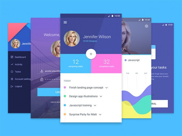
Many design concepts allow you to clearly and intelligently form the interface's structure and present it beautifully to users. One of these is Material Design.
Material Design is an interface for mobile and web apps based on Google's design standards. Thanks to it, the totality of Google services is perceived as a single digital system, thus creating a new user experience and ensuring the penetration of the corporation's services into all areas of human life.
Before introducing this concept, different products and even different versions of the same service (mobile and desktop) had significantly different designs. Because of this, users had difficulty navigating between them. Even the attempt to develop a unified style for Android Holo apps didn't solve the problem - people were still confused about the interfaces. Transition to Material Design improved user experience.
The main principles of Material Design are:
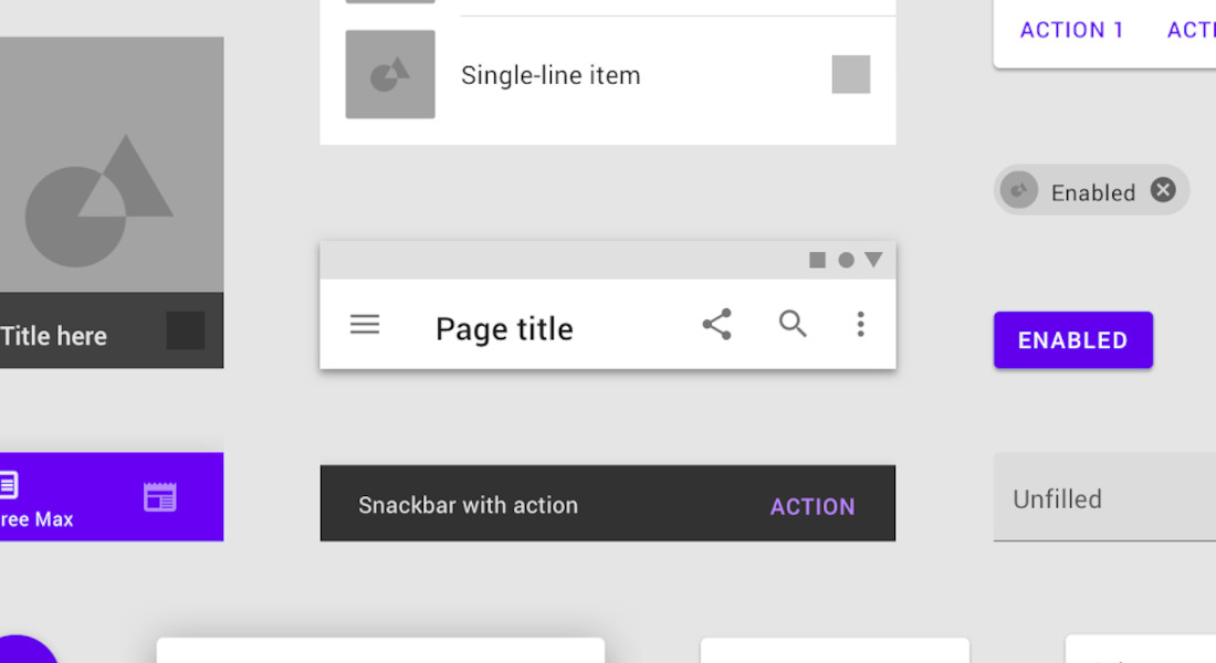
- Tactile surfaces. All interface elements are layers of digital paper. They are at different heights and cast shadows. They can also stretch, change shape and color, and connect to each other. This helps users distinguish between primary and secondary elements and makes the interface intuitive.
- Polygraphic design. Everything pictured and written on the layer-elements is subject to the laws of print design. Each image and text is "printed" in ink. As a result, you can accentuate the user's attention to the desired element and indicate the hierarchy of the interface.
- Conscious animation. All the elements on the screen can not just appear and disappear because, in reality, it does not happen. Objects move smoothly from one to another and tell the user how the interface works. Over time, the battle of the browsers has led to innovations like these, with each browser enhancing its ability to support smoother, more realistic animations.
- Adaptive design. The interface must be optimized on all devices and screens, no matter which product we take as an example. And everything should look, work, and respond the same everywhere.
There is no such thing as a separate material UI library. There is an implementation of a material design for a specific framework/library. MaybeWorks developers specialize on Material UI from Angular and MUI from React. We use them to develop apps for Android and iOS, including cross-platform solutions and web apps. Understanding what is ReactJS and how it integrates with Material UI helps in leveraging its adaptability across different front-end needs. This also makes future React migration easier, since Material UI can be reused even if the underlying frontend stack changes. If you’re considering an alternative to ReactJS, it’s worth noting that Material UI works seamlessly across multiple frameworks, making it adaptable for various front-end needs. Benefits of Material Design:
- Demonstration of interrelationships. Thanks to the animation, the hierarchy becomes simple and clear. A person can easily understand what happens when he or she clicks on a particular part.
- Focus of attention. Animation in no case distracts from the main action, corresponding to the third principle - its awareness.
- Expressiveness. Each company's product has its special character and style, which is clearly reflected in the animated details.
- Learning. People understand how to perform certain actions.
- Attractiveness. Even if we exclude the practical component, the animation looks quite interesting. As a result, the user shows interest and wants to interact with the product.
We use the MUI library for React-based apps to create Material Design because it saves our developers time and effort while ensuring a consistent, beautiful, and accessible UI.
Why do you need Material Design?
As we've said before, Material Design is designed to unify interfaces in products and services. According to Google developers, interface objects should have an analog, a kind of metaphor in the real world. And as a metaphor, they took regular paper and ink. This created an association with the real world and the use of familiar tactile characteristics and depth.
Paper in Material Design is characterized by thinness, flatness, and shadow. In addition to the usual physical properties, it also has a certain amount of magic - animation. This solution makes it easier for the user to understand the principles of the software and the transitions between states. As a result, animation brings the interface to life and shows the user how everything works. Curious how Ionic and React Native stack up in delivering this? Check Ionic framework React Native for a comparison.
Animation in Material Design
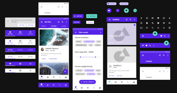
Animation is one of the Material Design fundamentals, spelled out in great detail in the guidelines. It is needed to make the user interface expressive and easy to use. The animation must adhere to three principles:
- Informative. The animation shows the spatial and hierarchical relationship between elements: what actions are available to users and what happens if they perform one of them.
- Orientation. The animation focuses attention on what's important and doesn't distract from the main action.
- Expressiveness. Animation expresses the character, personality, and style of each product.
With these principles, animation allows the designer to better organize the feedback between the human and the interface. For example, the designer can:
- Designate a hierarchy to show the user how elements relate to each other.
- Teach so that the user understands the interface right while using the application.
- Add appeal to make the user want to interact with the product again.
By the way, one of the rules of animations in Material Design is that all items coming out of the screen should accelerate.
Features of Material Design
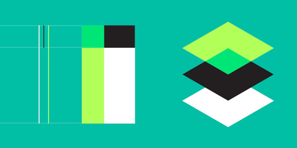
These features are derived from the basic principles of Material Design and are as follows:
- Shadow depth presence. It gives volume to the usual flat design and thus sets a kind of functionality by designating the structure of elements. For example, the higher the elevation of an object, the greater its shadow.
- Contrast typography. The typography sets the brand's style and creates the content's structure. This can be clearly seen in the headlines - a larger, darker font highlights them. This contrasts headlines and typeset text, which is both functional and beautiful.
- Modular grid. This technique comes from print design. Details are arranged according to key guides. The grid creates indents and better demonstrates structured information.
- Vibrant colors. In this concept, there are primary and accent colors. The purpose of the primary color is to indicate large areas. On the other hand, the accent color is slightly brighter and used point-by-point and in small quantities to highlight controls such as buttons, indicators, etc. In this way, it allows you to draw the user's attention to key details.
- Reaction animation. Any object should react solely to the user's actions, whether a touch of the finger on mobile devices or pointing the cursor on the desktop versions.
- From the general to the particular. This principle reduces the amount of information presented by decreasing screen size. Accordingly, it is possible to simultaneously show lists and more detailed information on large displays. But on small screens, you can make a drop-down list or even transfer the details to a new screen.
Many companies have reconsidered their approaches to creating design elements thanks to the Material Design concept. In particular, animations evolved from add-ons to almost a full-fledged part of the interface. This was done for the sake of user experience, optimization, and simplification. This approach became popular and set the direction for developing all digital design.
Why is Material UI leading web app design trends?
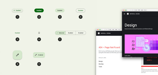
It all started with Google. Now their services are leading in terms of users. Considering the world statistics - it's hard to argue with that. Most average Internet users have free Gmail, cloud storage, and Google Drive and look for information directly in this search engine.
Generally speaking, everyone is used to this particular design. Users intuitively understand what will happen if they click on any button. Therefore, design from Google has become universal and created new standards in UI design.
Material UI is a well-developed and standardized design. Its principles are clear and logical. Users want to spend less time understanding a web application's interface. Here is a rule based on human psychology: the simpler, the better. The likelihood that the visitor will not leave a website a few minutes after loading is reduced if he understands how this resource works.
From all this logically comes the popularity of Material UI. Designers have picked up the trend and actively applied these design principles in developing mobile and web applications.
What is the Material UI library in React?
Material-UI is a popular open-source user interface (UI) library for building responsive and attractive web applications using the React JavaScript library. Material-UI provides a set of pre-built, customizable React components and design elements that follow Google's Material Design guidelines. Spotify, NASA, Netflix, and Amazon use Material UI.
Why do MaybeWorks developers use the Material UI library for React-based apps?

Material-UI is a popular React UI component library that provides pre-built components and design guidelines to help developers easily create beautiful and functional user interfaces. Here are a few reasons why we consider using Material-UI in our React projects:
- Consistent design. Material-UI follows the Material Design guidelines created by Google, which ensures a consistent look and feel across all components. This helps our developers create a cohesive and polished UI without spending much time designing from scratch.
- Reusability. Material-UI provides a vast library of components that can be used out-of-the-box or customized to fit specific needs. This makes it easy to create reusable components, reducing development time and effort.
- Flexibility. Material-UI components are highly customizable, making it easy to tweak them to fit the project's specific needs. This allows MaybeWorks developers to have full control over the appearance and functionality of the components they use.
- Accessibility. Material-UI is built with accessibility in mind, ensuring that the components meet the Web Content Accessibility Guidelines (WCAG) and can be used by people with disabilities.
- Documentation and support. Material-UI has excellent documentation, including a live editor that allows our developers to experiment with components and see the results in real time. The Material-UI community is also active and supportive, providing help and guidance on various issues and questions.
A quality application interface should always be combined with quality functionality. Involved MaybeWorks developers will help you create a web application that is thoughtful both in terms of design and functionality.
Feel free to contact MaybeWorks to augment your IT team with React developers for hire in the shortest possible time!
